How To Craft The Perfect Travel Website Homepage
“If you build it, he will come.”
- Kevin Costner, on the efficacy of attracting qualified leads with a well-written travel website.
Okay, perhaps Kev didn’t mean it quite like that.
But that doesn’t make the sentiment any less true; if you take the time to build a thoughtful travel website for your brand, measurable business growth is almost certain to follow.
And a thoughtful website begins with a great homepage.
This article will show you exactly how to create an effective, attractive homepage through actionable tips and real examples.
By the end of it, you’ll have everything you need to turn your travel website into a powerful sales tool.
Let’s get started.
Contents:
Why a great travel website homepage is important
The must-have features every homepage needs, broken down
How to build an amazing travel website homepage
Getting started with research and planning
Applying what you’ve learned so far
Case studies for great travel website homepages from different niches
Tour and excursions
Booking platforms
Travel gear retailers and manufacturers
Traveltech / SaaS platforms
The next steps for growing your travel brand online
Why Travel Websites Need a Great Homepage
If your website is the digital salesperson for your brand, the homepage functions as the smiling face that seals the deal. It’s the first thing they’ll see, so it has to make a great impression.
Your travel website homepage needs to be welcoming, engaging, and reflective of all the great value you have to offer potential customers.
That’s why getting it right is so important.
What is the purpose of a homepage?
A homepage is there to tell site visitors exactly what your business is all about.
It introduces your brand and your mission to the world and lets people know they’ve come to the right place.
More than that, the homepage serves to paint a picture of all the wonderful ways your products or services can benefit the consumer.
If you’re running an online business, having a bad homepage is as good as hanging a dusty “Closed” sign on the front door.
But how do I tell if my homepage is good or bad?
First, you need to ensure it has all the necessary ingredients required to make your website, not just attractive, but effective.
This next section will tell you exactly what those ingredients are and how to apply them.
Essential Features All Travel Website Homepages Need
Every brand has different needs and different goals unique to its specific business.
But for most, the main objective is the same: Be as successful as possible while consistently growing and improving.
To achieve the goal of running a successful travel business online, travel companies need to make sure their website homepage includes the following features:
Consistent messaging that promotes and promises the main goal the business seeks to achieve (your Value Proposition).
High-quality, relevant images and/or video content.
Powerful social proof in the form of testimonials and/or notable associated organisations.
An obvious and engaging Call to Action (or ten).
Important benefits/features of the main product(s) or service(s).
Well-crafted copy that is persuasive, easy to understand, and conveys the brand’s distinctive voice.
To help you tick these off, I’ve broken down each point one by one.
Unique Selling Proposition / Value Proposition
The difference between a Unique Selling Proposition (USP) and a Value Proposition is that the former refers to a special feature that makes your product different than anything else on the market, and the latter is the main promise and benefit your product provides.
Sometimes, the USP and the Value Proposition can be the same thing. Other times, you’ll have to dig deep to discover your USP.
It’s worth noting that a USP may not always be necessary. If you do not have any direct competitors within your industry, there may be no reason (or way) to point out why your product is better than theirs.
But for most businesses, knowing the one thing that sets you apart from your competitors can be what makes customers choose your brand over anyone else’s. Once you’ve found your USP, plaster it all over your website.
Use your Value Proposition and your USP as the trunk from which all your advertised features and benefits stem.
Make your main promise central to every piece of copy you produce and your chances of online success will greatly improve.
High-quality multimedia
Tourism is the Imagination Industry.
It’s where consumers shop with their eyes half-closed, dreaming of living their best vacation lifestyle. And you can really capitalise on this aspect to make the buying process ideal for your perfect customer.
Fill your homepage with beautiful, high-quality, relevant photos, videos, and graphics to immediately give readers the feeling that they’re already on holiday.
Social proof
Humans are far more willing to believe in a product or service if they can see that other people have tried it and enjoyed the outcome.
It’s part of our natural psychology to trust something more once it’s been verified by people just like us.
Associated brand logos and (authentic) customer testimonials are the perfect way to do this.
Put them as close to the top of your homepage as reasonably possible, ideally just below the fold, if not above it.
Software company ClickUp lets site visitors know they’re in good hands with these big-name logos.
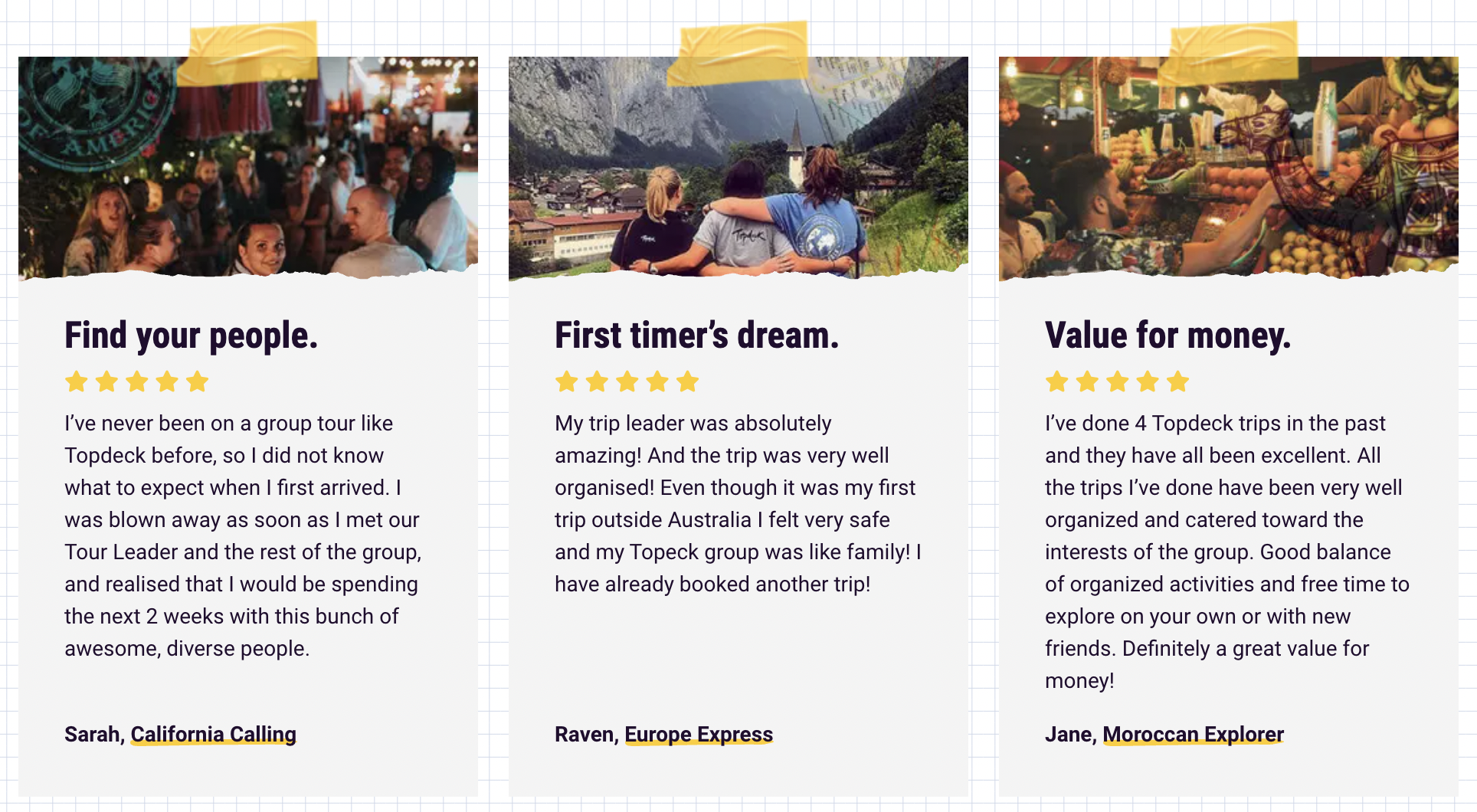
Testimonials also serve as an excellent opportunity to handle customer objections and promote your USP in action.
Check out how popular tour operators Topdeck uses theirs to persuade prospective buyers of the benefits of booking a tour with them:
CTA
This is one feature that would seem obvious, but so many travel companies seem to miss: Including a clear Call to Action at the top of the homepage.
Humans are misguided creatures; we need clear instruction and direction in order to take action.
You want your CTA to be right at the top of your homepage so that it’s super easy for your visitors to follow the steps you want them to take.
It’s also advisable that you have multiple subsequent call-to-action buttons/links sprinkled throughout the lower parts of the page as well.
What those CTA buttons should say depends on what you’re selling.
If you’re running a booking platform, it might be a search bar with a button that says “Search Flights”.
If you’re a travel SaaS company, it might be a big button that says “Sign up for free” or “Download app”.
You can even get creative with it and weave your USP into the CTA itself. Acronyms stacked on acronyms… What could go wrong?
Benefits and features
After learning about what you’re offering from your main headline and body copy, visitors are naturally going to ask, “How?” and, “Why?”
To answer this, break your page down into easily understood sections describing each of the main features of your product or service.
It’s important to keep in mind that your features should be presented as the benefit they offer a prospective buyer where possible, rather than the fact or statistic behind it.
So, if you were selling, say, winter jackets, instead of your headline reading,
“Extra-thick foam-padded sleeves”
you might want to say,
“Stay warm and cosy, even in the snow.”
Persuasive and clear copy
Lastly, all the copy on your page needs to be written to the highest standard achievable.
Your website copy is your way of directly speaking to the consumer; it needs to make a good impression if you wish to close the sale.
Make sure every piece of copy on your site is:
Clear, simple, and flows smoothly from one sentence to the next.
Persuasively written with a single reader in mind.
Free of grammatical errors and spelling mistakes.
Consistently written in the identifiable voice of your brand.
Optimised both for skim-readers and fussy analysts.
To feel confident you’ve nailed the copy for your homepage, consider hiring a professional website copywriter to handle the hard work for you.
Now that you know what goes into a great travel website homepage, it’s time to look at how you can apply these various features to your own site.
Crafting the Perfect Travel Website Homepage
All right. You know what you need. You know why you need it.
But where do you even start? How do you put it all together in a logical way?
You’re about to find out.
Getting started on your travel website homepage
You can’t build a great building on a weak foundation.
We’ve covered what it takes to build an amazing homepage, now it’s time to prepare.
And that means research.
Here are some of the key areas to research before writing your website copy:
Your ideal customer: Their wants, their needs, their challenges – anything and everything about the perfect buyer for your products or services.
Your competitors: What are they doing well? What are they doing poorly? How can you capitalise on their weaknesses and missed opportunities?
Your product: Have you figured out your USP yet? Spend some time really getting to know the thing you’re offering. Try to look at it from the user’s perspective.
Your industry: Learn what’s trending, what people are talking about now, and what they’re talking about always. Can you weave that into your copy?
Your business: Is there an enchanting backstory behind your brand that you could incorporate into your site? Maybe there’s an amazing selling point hidden in the tale of how you and your co-founder became friends.
Your past and current customers: Find out what they loved about your product, the problems it solved for them. Have you found your perfect testimonial yet? Have you asked for one?
Before you write anything, figure out the answers to all these problems first.
Then it’s time to start building.
Applying all you’ve learned to your website homepage
Once you’ve got a solid knowledge base, the next step is to apply it to your site.
Use your research to start developing the story you want to tell with your brand. Remember to include all the essential features of a good travel website homepage – you can use the first section of this article as a checklist while you go.
Once you’ve got something that resembles a half-decent draft, optimise your page to fit your specific niche within the travel industry.
The following case studies offer wonderful examples of how to do this.
Travel Website Case Studies: Inspiration for Building Your Homepage
Let’s take a look at how some of the best travel companies are crushing it with websites that perfectly match their brand and the tone of their industry.
Tour operator and excursion company homepages
Tour operators, excursion leaders, and travel guides are in the business of peddling life-changing experiences. They offer people the chance to explore, learn, and grow.
And luxury slow-travel specialists Butterfield & Robinson perfectly encapsulate this ethos with their beautiful website homepage.
Above the fold
At the top of the page, you’ll find a slider capturing some of the best moments from some of their tours.
The slider actually shifts at a slow pace to align nicely with the brand’s USP, which is presented in the upper-left-hand corner by the phrase: “Slow down to see the world”.
Accompanying the smooth slideshow is a clean, personalised search bar with a clear CTA that draws the visitor in and plays to their emotions.
Below the fold
Below this feature is another slider – this one loaded with testimonials from highly touted brands. And accompanying it is the all-important link to the latest coronavirus updates.
After some excellent social proof, Butterfield pads their page with more benefits and CTAs, all written with simple and effective copy.
Booking platform homepages
Much like tour operators, booking platforms need a homepage that inspires as well as makes it simple to book.
The challenge for these sites, however, is how many booking platforms there are out there offering nearly identical services.
To counter this, a powerful USP and a distinct brand voice can make all the difference, as demonstrated by Skiplagged with this cleverly written homepage.
Above the fold
What’s especially great about this homepage (besides the fun copy) is the way they’ve managed to include some social proof above the fold, so it’s the first thing visitors will see.
Below the fold
More bold and memorable copy immediately follows, as well as further encouragement to take action by way of high-quality images supporting different flight destinations.
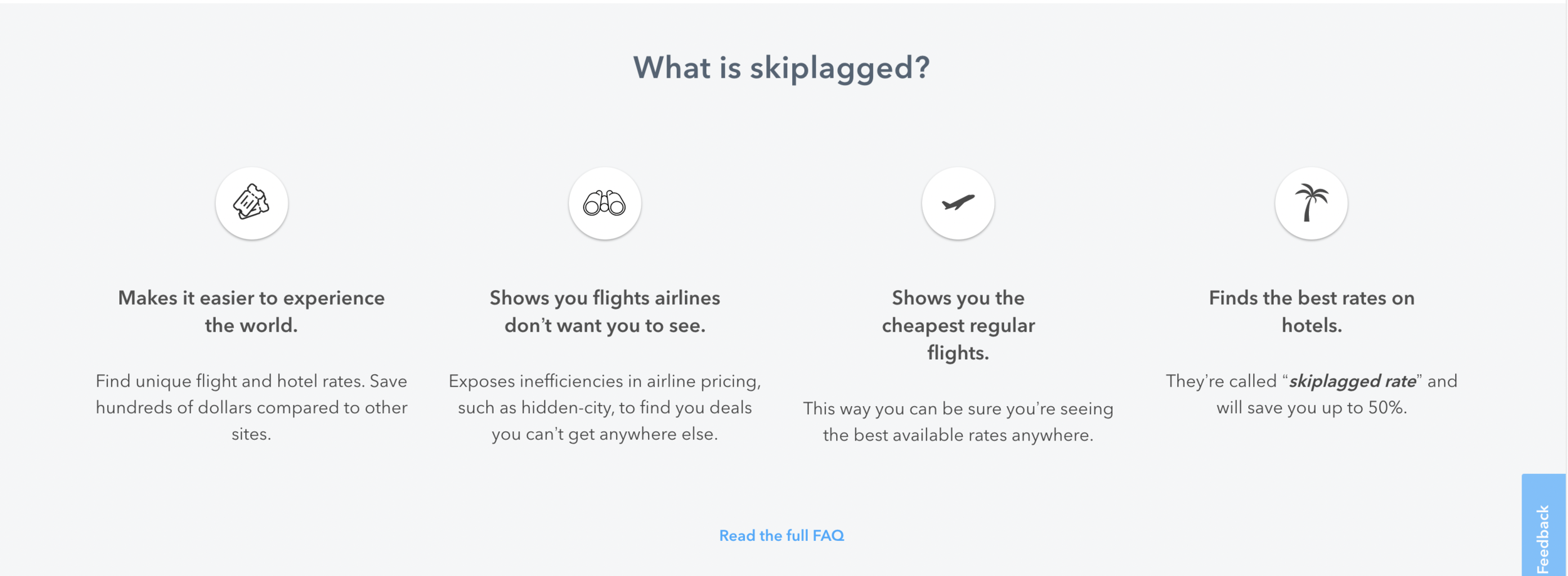
And further down the page, you’ll find a few of their key features disguised as incredible benefits for the customer:
Travel gear retailer homepages
When it comes to e-commerce, you can get away with a bit more “hard-selling” straight off the bat.
This is because visitors to your site are most likely there because they’re already halfway along the sales funnel and are just about ready to buy.
But that’s no reason for brands to ignore an opportunity to showcase their voice and their mission whilst simultaneously promoting their products on the homepage.
Tree tent manufacturers Tentsile have proven that they understand this concept very well, as demonstrated below.
Above the fold
There’s a lot crammed into the top of this homepage, but none of it is wasted space:
As you can see, this above-the-fold homepage has it all: USP, high-quality images, a CTA, benefits and features, and even a “Tribe Loyalty Program” button to give viewers a sense of community.
Below the fold
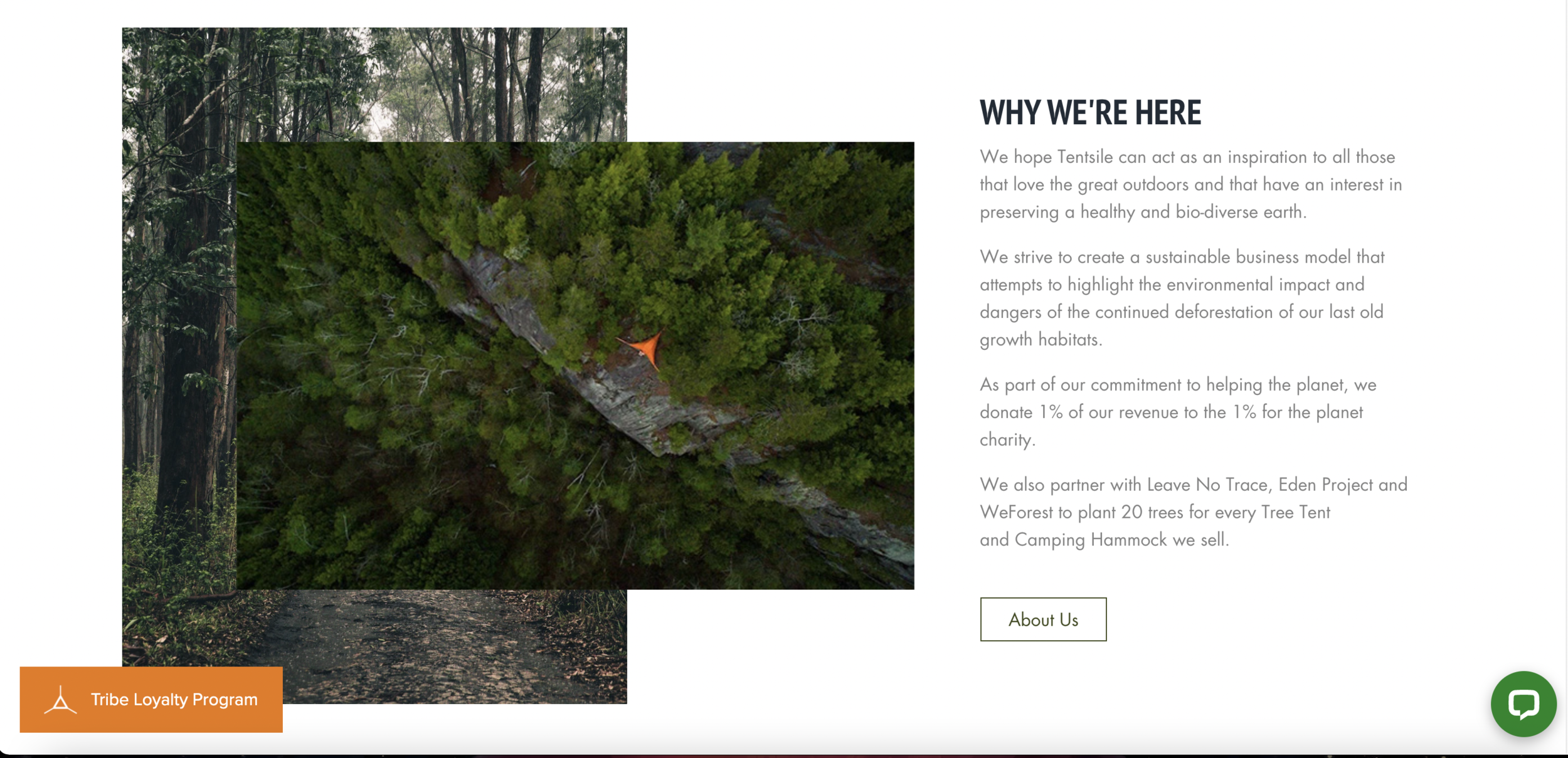
A little further down, Tentsile managed to squeeze in a bit about their brand and their mission, as you can see pictured above.
And below that are some associated sites with adjacent brand values that reinforce the mission and show how much they care.
Directly beneath this is an opportunity to join their mailing list, where Tentsile can build a qualified leads list for future email marketing campaigns.
Travel tech SaaS homepages
The world of travel tech is one of perpetual growth. Businesses and consumers are becoming more and more digitally minded every year.
Business travel leaders TravelPerk have been ahead of the game for a while now, as demonstrated with their smart yet simple website homepage.
Above the fold
From the jump, we are given a clear idea of what they do, how it looks, and where to get started.
The copy is direct, simple, and says exactly what it needs to say.
Their purpose is also emphasised by images cleverly shaped to resemble a phone screen and a computer screen, so you know exactly what it will look like when you sign up.
Below the fold
Underneath the main screen is a neat blend of brand mission + product benefits that are easy to understand and tell you exactly what TravelPerk is all about.
“Put safety first” and “Offset your carbon footprint” not only tell you what you’ll be able to achieve by using their platform, they also convey the company’s values in an indiscreet, unboastful manner.
And of course, what better way to follow this up than with some seriously impressive social proof:
As you can probably tell by now, there are certain elements that all great travel website homepages share.
Now that you know what they are, you’ll be able to go ahead with adding them to your own site and prepare to reap the rewards!
Final Tips for Boosting Homepage Performance
All right, we’re almost done.
So you’ve got a great travel website homepage. What’s next?
Writing the copy
Sure, the above formulas for a great travel website homepage are all well and good.
But maybe you’ve discovered that writing simple and persuasive web copy isn’t as easy as it seems.
You’re right; it’s not.
But there’s no reason to get upset about it; there are plenty of great website copywriters out there to give you a hand.
If you’d rather leave the writing stuff up to a professional, send a message using this form and we can work together to have your website as up-to-date and high-quality as possible.
SEO
The next step to optimising your travel website is to load it with SEO, or Search Engine Optimisation.
SEO is the process of getting your website to show up on the first page of Google’s (and other platforms’) search results.
For a comprehensive breakdown of what SEO is and how it works, check out Backlinko’s full guide here.
Marketing
Once you’ve got your website homepage to the completion stage, the next thing you’ll want to do is show it to the world.
This is achieved through carefully considered digital travel marketing, which can include emails, ads, social media, and affiliate marketing strategies.
A good marketing strategy begins with a strong understanding of the do’s and don’ts.
This blog will teach you all about what to avoid in your digital travel marketing strategy, and what to keep in.
Seek advice
If, after all this, you’re still stuck, it might be time to hire a freelance travel content writer.
I can help you identify the areas in your current digital landscape that have room for improvement and develop a thoughtful strategy for building up the rest of your travel website.
Happy online travels!


